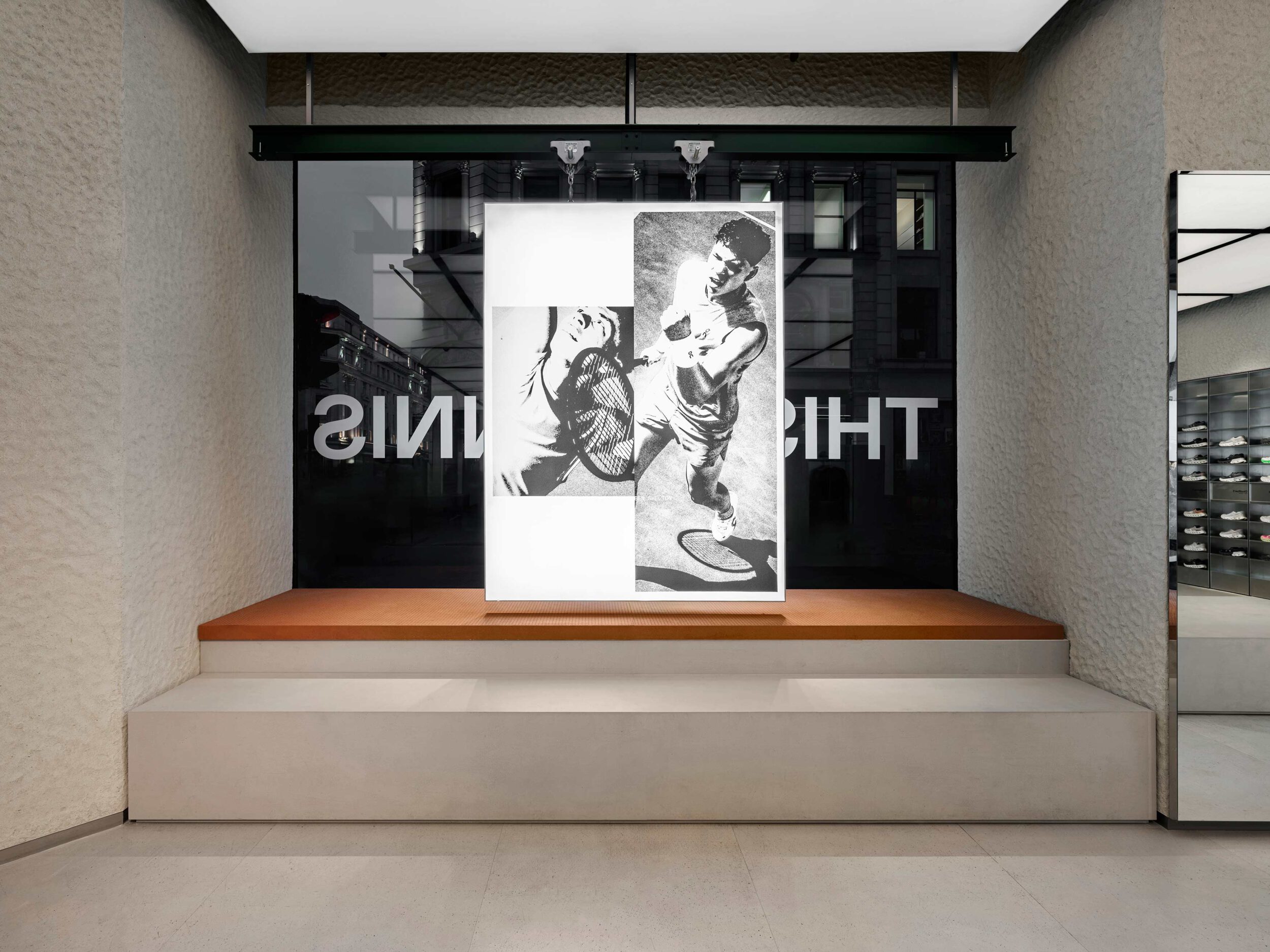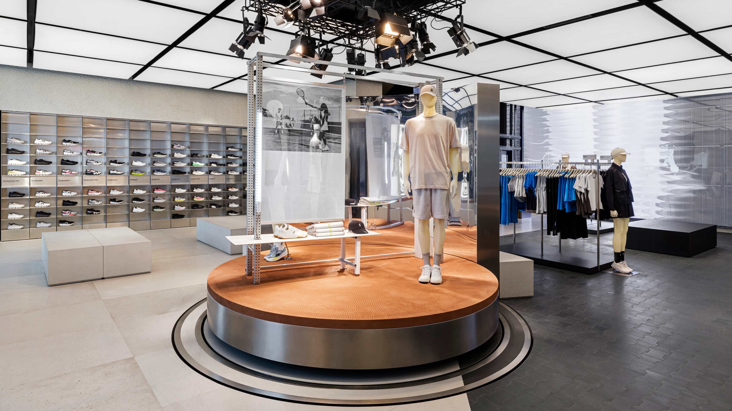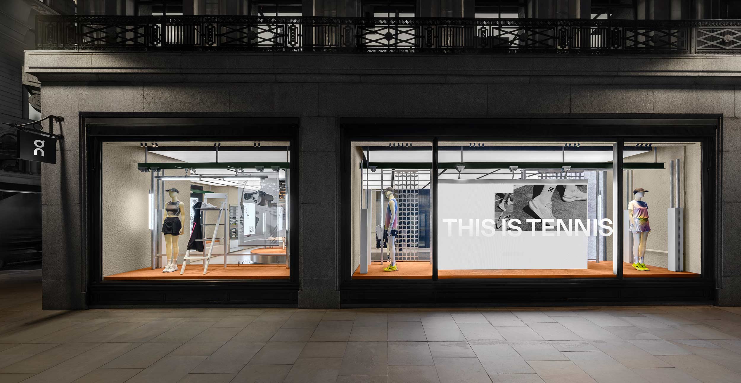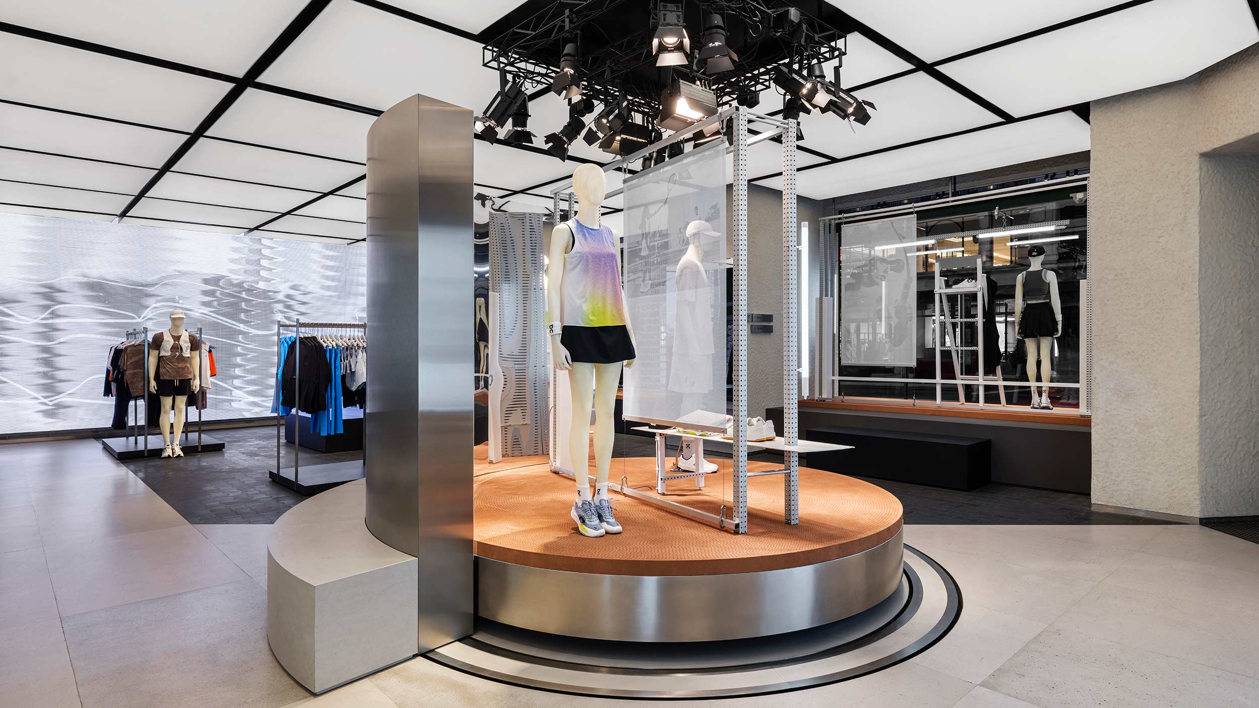


On approached us with a bold ambition: to redefine the visual language of tennis through the lens of motion, energy and urban culture. Their campaign This is Tennis set out to challenge tradition and inject fresh momentum into the sport–not on the court, but on the streets. Centred around their flagship store launch, the goal was to create an identity that felt just as dynamic and unpredictable as a rally in full flow.
At the core: movement.
But not just any movement–movement with tension, rhythm and impact. Like a tennis ball rebounding off hard concrete. Quick cuts. Sharp turns. Kinetic pauses. Our task was to translate this physicality into a graphic system that could drive both campaign and space.
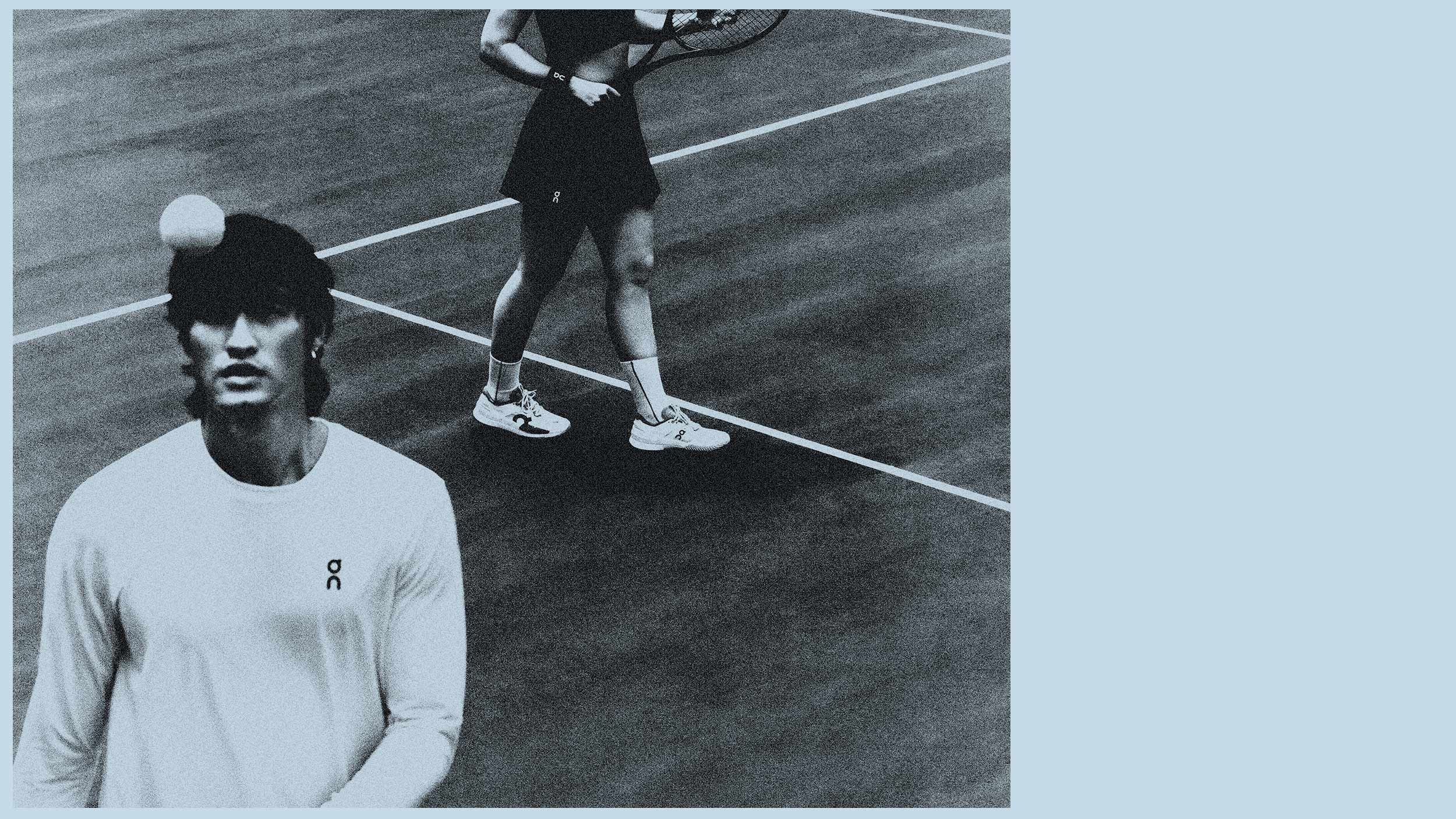
We built a modular design system based on the physics of a rally–every bounce, spin and shift in direction shaped the layout. The imagery, featuring pro players Ben Shelton and Iga świątek, was fragmented and reassembled to feel in motion. Not posed, but caught mid-play. The typography followed suit, set along curved paths that echoed the arc of a serve, distorted slightly as if deflected by impact.
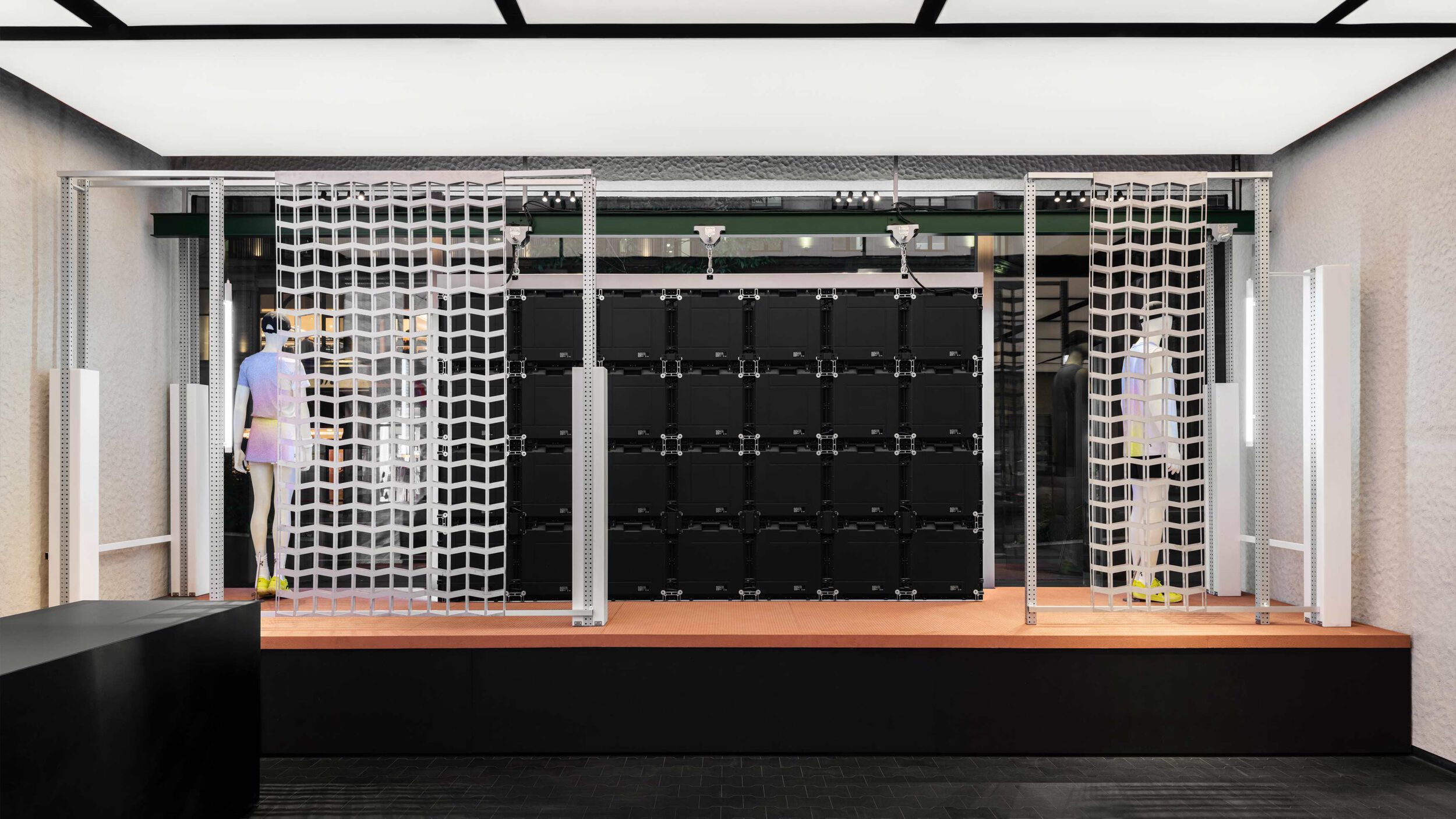
The system lives across large-scale print, in-store activations, and digital touchpoints. Graphic cuts and overlapping image planes evoke the feeling of speed and rebound. Brand and body move together–with nothing static, everything charged.
The result is a campaign identity that lives in motion–adaptive, raw, and full of intent. The flagship space doesn’t just showcase a product; it frames a new attitude towards tennis itself.
This is Tennis reframes the sport not as tradition, but as tension, energy and culture in play.
Creative Team:
Creative lead: Mattia Marchese
Art director: Michel Giesbrecht
Graphic designer: Carolina Sanches
Motion design: Bareis + Nicolaus
Project management: Catherine Daniela Bernays
